

Black and white rooms can go one of two ways. Done well, they feel sharp, timeless, and full of quiet drama. Done poorly, they end up looking stark and cold. The difference almost always comes down to ratio, texture, and where you place your darkest and lightest tones.
Here are 20 ideas built around that thinking:
1. Use the 60 30 10 Ratio as Your Starting Point
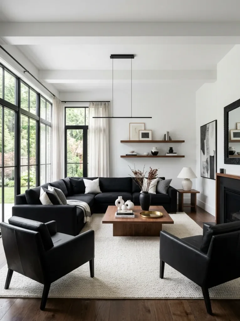
A classic design rule works especially well in black and white rooms: roughly 60 percent of the room in your lightest tone, 30 percent in your darkest, and 10 percent in an accent, whether that’s a warm wood tone or a single muted color. Without this kind of ratio, black and white rooms tend to either feel washed out or overly heavy.
Walk through your room mentally and assign each major surface- walls, floor, sofa- to one of these three buckets. If everything lands in the 60 percent light category, the room will read as flat rather than dramatic.
This ratio also gives you a useful check before buying new furniture. If you’re already close to 30 percent black and considering another dark piece, it’s often better to shift that purchase toward your accent category instead, so the balance doesn’t tip too far in one direction.
2. Choose True Black Over Charcoal for Accents
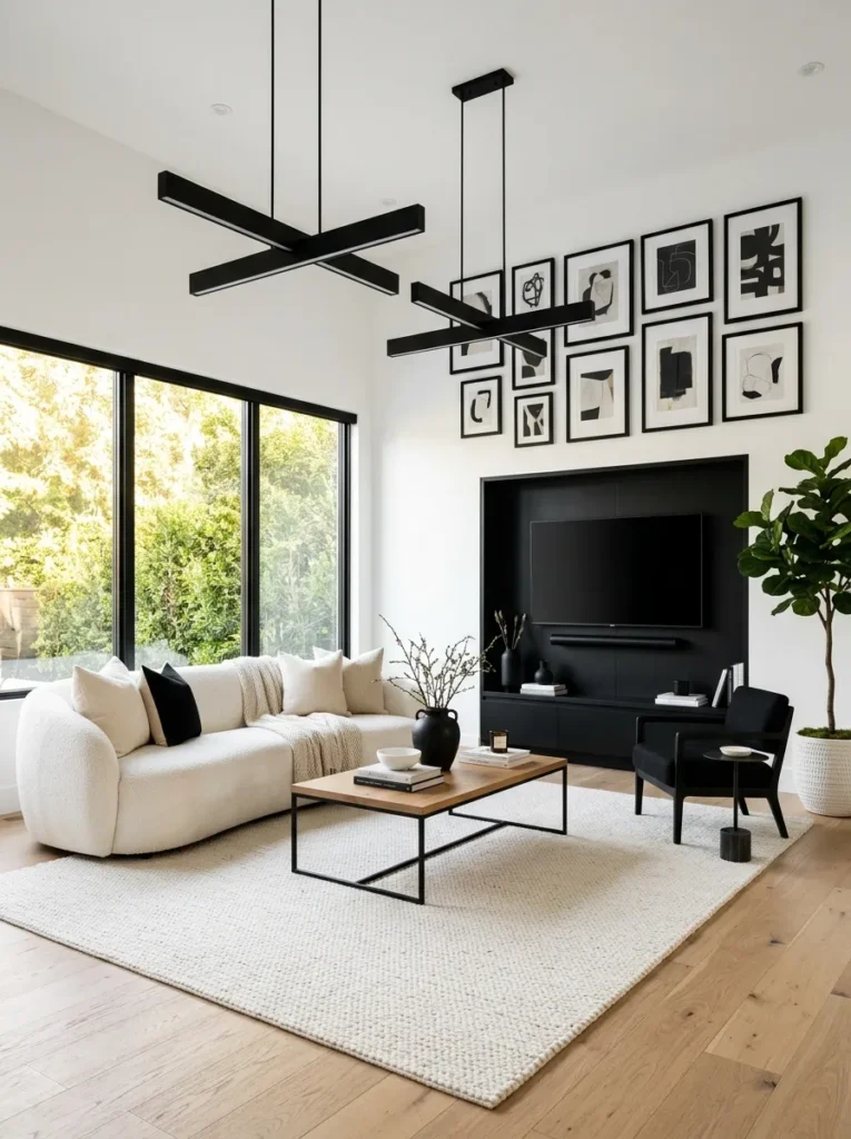
Charcoal and near black tones can end up looking like a mistake rather than an intentional choice in a black and white scheme. When you want a black element, whether it’s a frame, a light fixture, or furniture legs, commit to a true, deep black so the contrast reads as deliberate.
This matters more under artificial light than most people expect. A charcoal that looks nearly black in a showroom can shift noticeably lighter under warm bulbs at home, so it’s worth testing a sample piece in your actual room before committing to a larger purchase.
3. Add Warmth Through Wood, Not Color
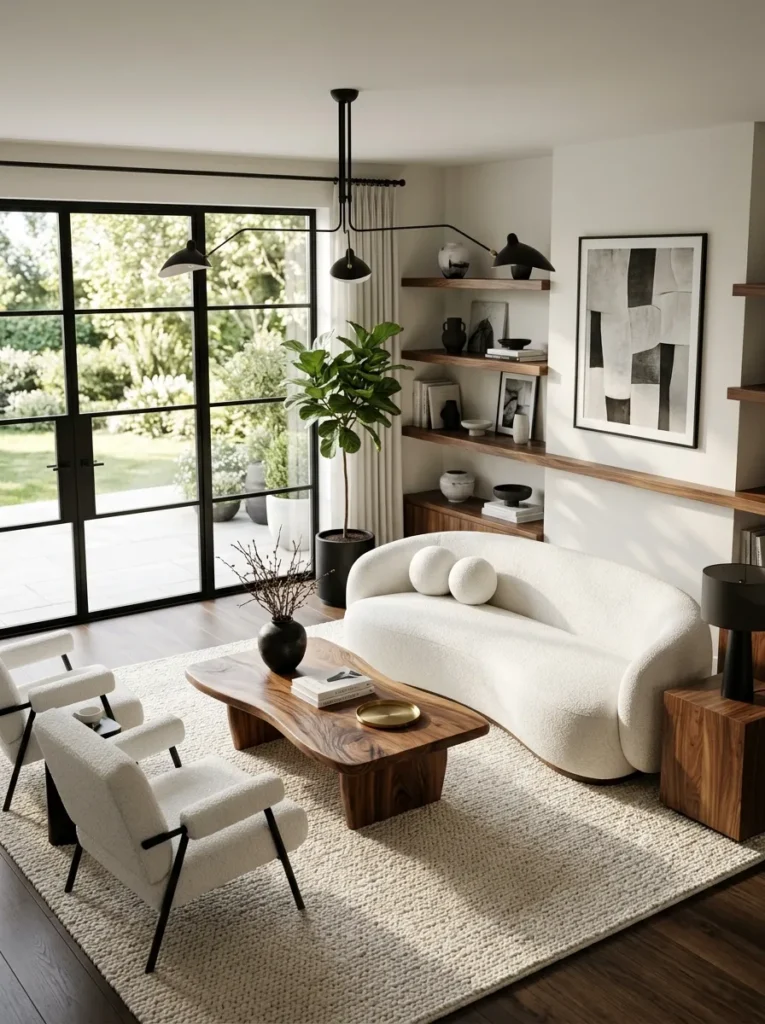
Pure black and white rooms risk feeling cold, and the easiest fix is a warm wood tone rather than introducing another color entirely. A walnut coffee table or oak flooring keeps the scheme technically monochrome while giving the room the warmth it would otherwise lack.
Treat this wood tone the same way you would a third color in the room: choose one and repeat it consistently across two or three pieces, rather than mixing several different wood finishes that could end up competing with the black and white palette instead of supporting it.
4. Use a Graphic Black and White Rug as the Anchor
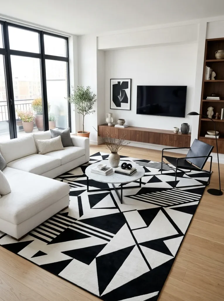
A rug with a bold geometric or ikat pattern in black and white gives the room a strong focal point at floor level. Since the rug covers a large surface area, it does more to set the tone of the room than almost any other single piece.
Once you’ve chosen this rug, let it guide the rest of your decisions. Pull the exact ratio of black to white you see in the rug’s pattern and use that as a rough guide for how much black versus white to use in your furniture and walls.
5. Layer in Texture to Avoid a Flat Look
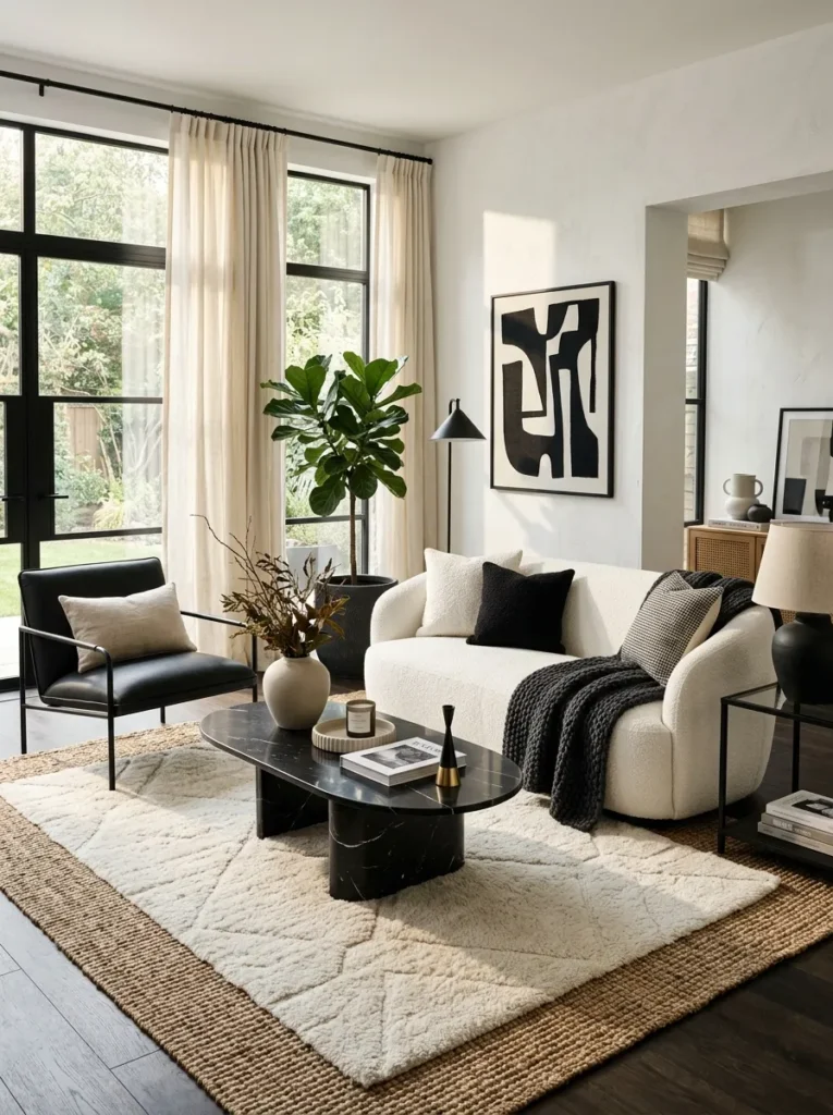
Because you’re not using color to create depth, texture has to do that work instead. Mix a smooth leather chair, a nubby boucle sofa, a woven jute rug, and a matte ceramic lamp so the room has variation to the touch, not just to the eye.
- Smooth: leather, glass, lacquered wood
- Nubby: boucle, chunky knit throws
- Woven: jute or sisal rugs, rattan accents
- Matte: unglazed ceramics, painted metal
Try to include at least one texture from each category somewhere in the room. A space that’s all smooth surfaces, or all nubby ones, tends to feel one note even with a technically correct black and white color balance.
6. Choose One Statement Black Piece of Furniture
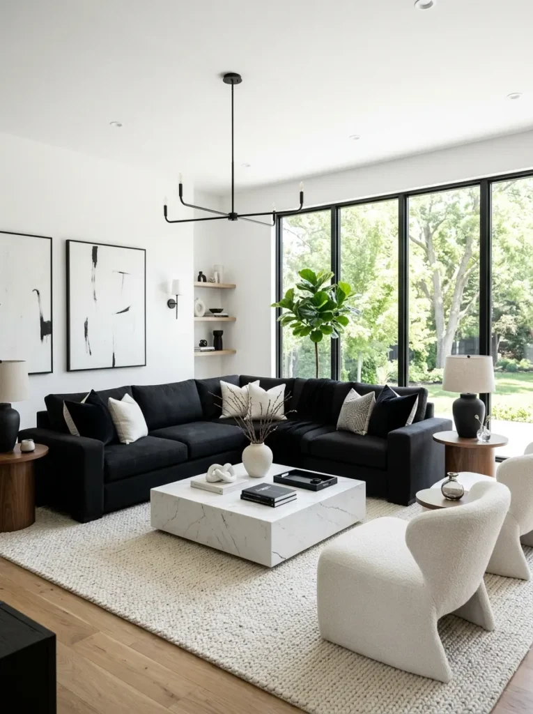
Rather than scattering small black accents everywhere, pick one larger black piece, a sofa, a media console, or an accent chair, to serve as the room’s visual anchor. One confident dark piece reads as intentional, while five small black accessories can start to feel scattered.
This single piece also becomes the natural reference point for every other black element in the room. When choosing frames, hardware, or lighting later, match their finish back to this anchor piece so the black tones throughout the space feel connected rather than randomly assembled.
7. Frame Windows in Black for Architectural Contrast
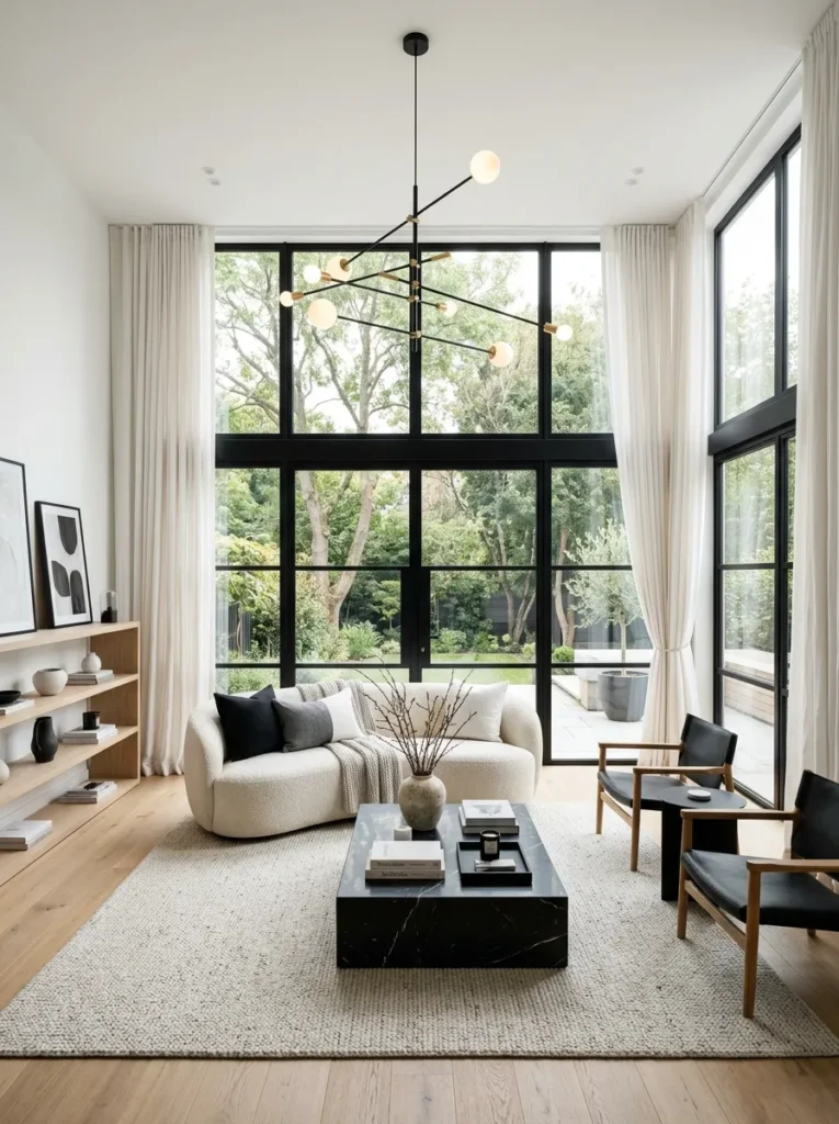
Black window frames or black curtain rods against white walls create crisp, architectural lines that instantly sharpen the look of a room. This detail is especially effective in rooms with large windows, since it turns the window itself into a design feature rather than just an opening in the wall.
If replacing window frames isn’t realistic, black painted trim or a simple black curtain rod can achieve a similar visual effect for a fraction of the cost and effort.
8. Use Black and White Photography as Wall Art
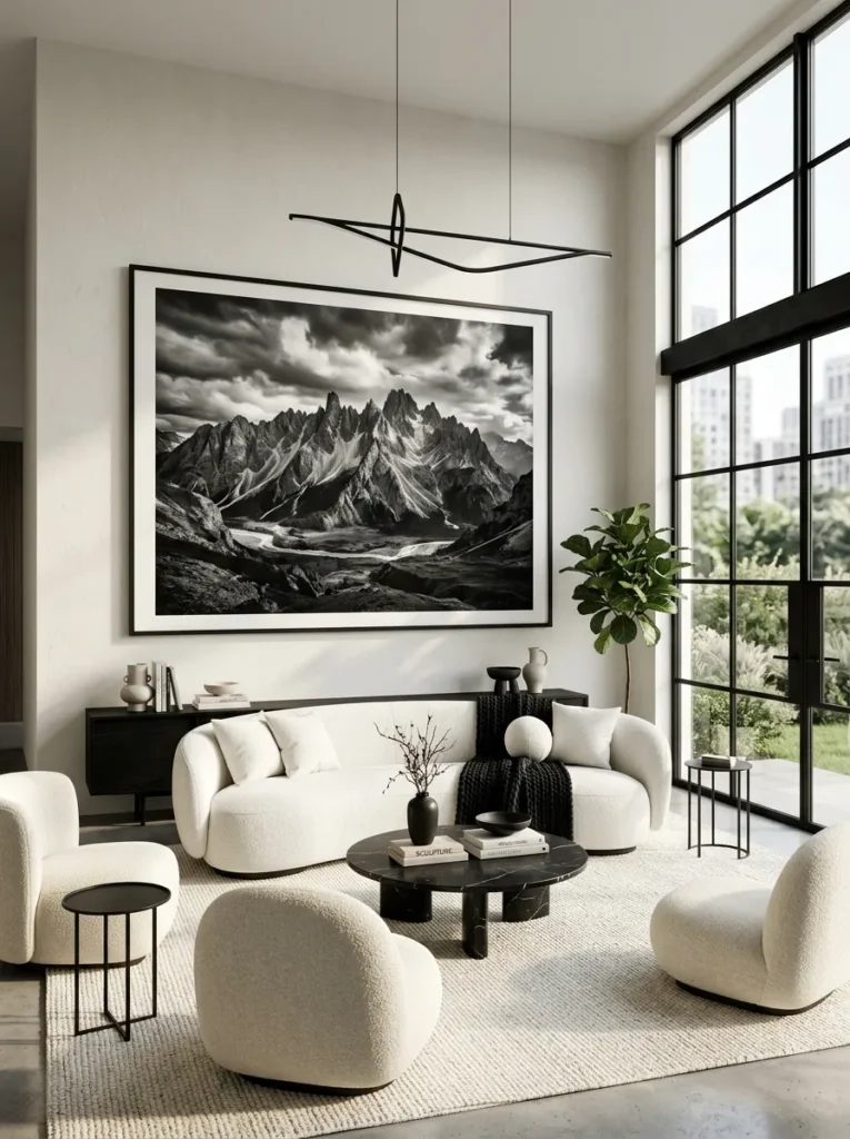
Black and white photography fits this color scheme more naturally than colorful art, which can feel jarring against such a controlled palette. Choose a few large format prints rather than many small ones, since oversized black and white photography reads as more gallery-like and intentional.
Architectural or landscape photography with strong contrast between light and dark areas tends to work especially well here, since the image itself echoes the same high contrast principle driving the rest of the room.
9. Add a Black Framed Gallery Wall
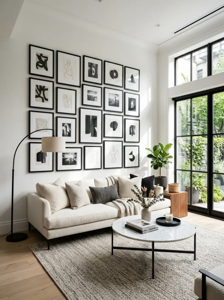
If you prefer a gallery wall over single statement art, keep every frame in matching black to maintain the scheme’s discipline. A mix of white and black frames together tends to look unplanned, while a uniform black frame collection reads as curated even with varied photo sizes.
Varying the mat width inside each frame, rather than the frame color itself, is a good way to add subtle variation to the wall without breaking the consistent black frame rule.
10. Choose Black Hardware and Fixtures Throughout
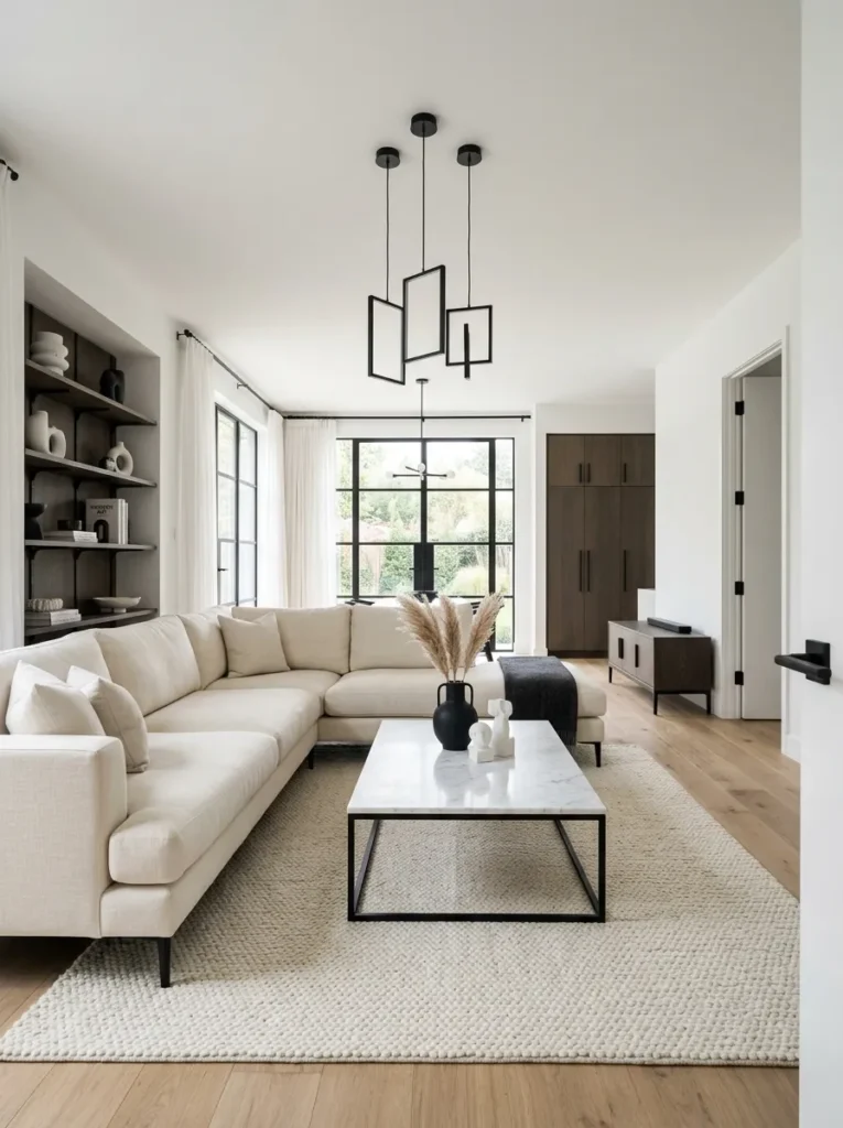
Light switches, door handles, curtain rods, and cabinet pulls in matte black quietly reinforce the scheme in details most people won’t consciously notice but will feel. These small, consistent choices are often what separates a genuinely cohesive black and white room from one that just has black and white furniture in it.
Swapping these fixtures is also one of the lowest-cost ways to strengthen the scheme, since most hardware updates cost far less than new furniture but touch nearly every part of the room at once.
11. Use a Checkerboard or Striped Accent
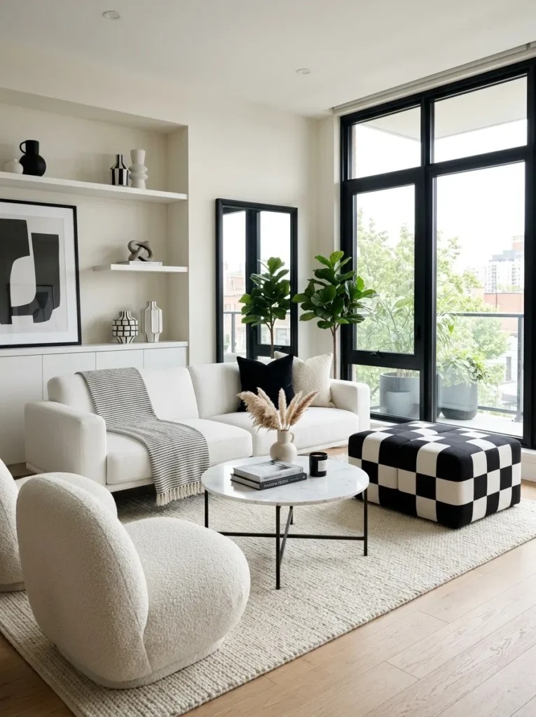
A checkerboard patterned pillow, a striped throw blanket, or even a small checkerboard side table adds graphic energy without introducing a new color into the room. These patterns feel classic within a black and white scheme rather than trendy, which helps the room age well.
Keep this kind of bold graphic pattern to one or two spots in the room. Used sparingly, it reads as a deliberate accent, but repeated across several pieces it can start to feel busy rather than sharp.
12. Balance Heavy Black With Airy White Space
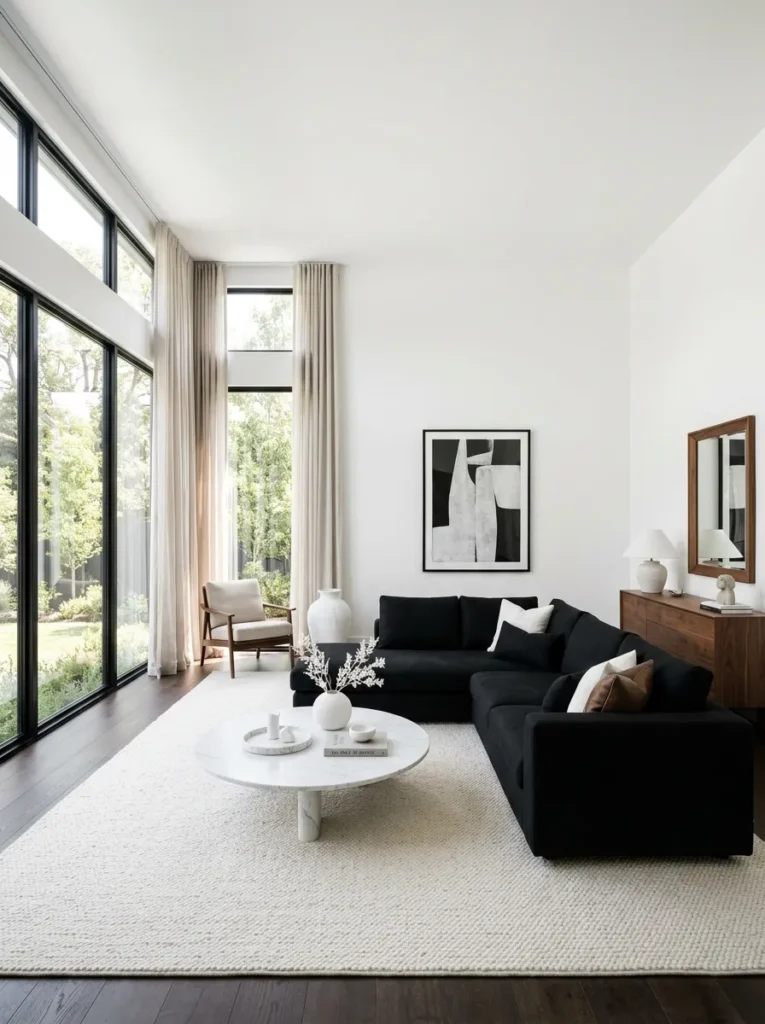
For every dense black element, like a dark sofa or a black accent wall, leave a corresponding amount of open white or light space nearby. This visual breathing room keeps the black from feeling oppressive and lets it read as bold rather than heavy.
A useful way to check this balance is to squint at a photo of the room. If one side reads as a solid dark block with no light relief nearby, it’s worth shifting a lighter object, like a white vase or a cream pillow, into that area.
13. Add a Black Accent Wall Behind Light Furniture
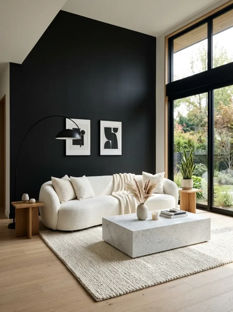
Instead of an all-white room with black accents scattered throughout, try flipping the formula on one wall. A black accent wall behind a white or cream sofa creates strong contrast and gives the room an obvious focal point the moment you walk in.
This approach also works well if you’re not ready to commit to black furniture, since the wall alone carries most of the drama while your furniture stays flexible and easy to update later.
14. Choose Marble or Marble Look Surfaces
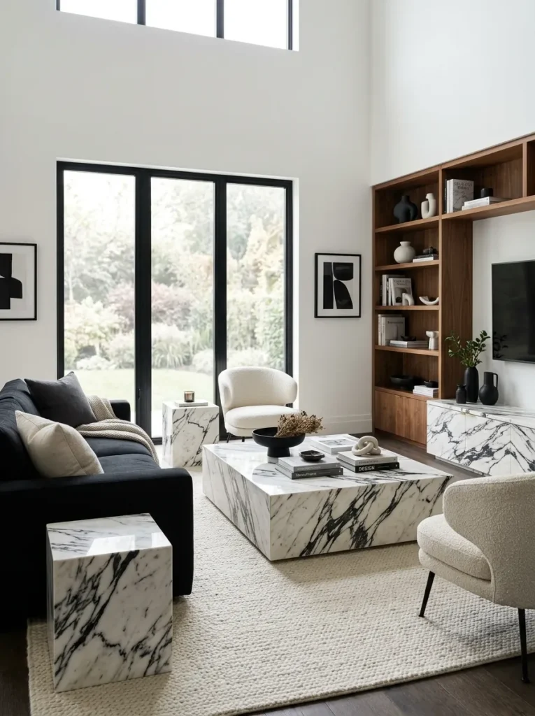
Marble’s natural black veining running through white stone captures the black and white aesthetic in a single material. A marble coffee table or a marble look console brings the scheme into your furniture surfaces without needing separate black and white pieces side by side.
Because real marble can be costly and requires some care to maintain, a quality marble look laminate or porcelain surface offers a very similar visual effect at a more accessible price point.
15. Use Sheer White Curtains Against Black Trim
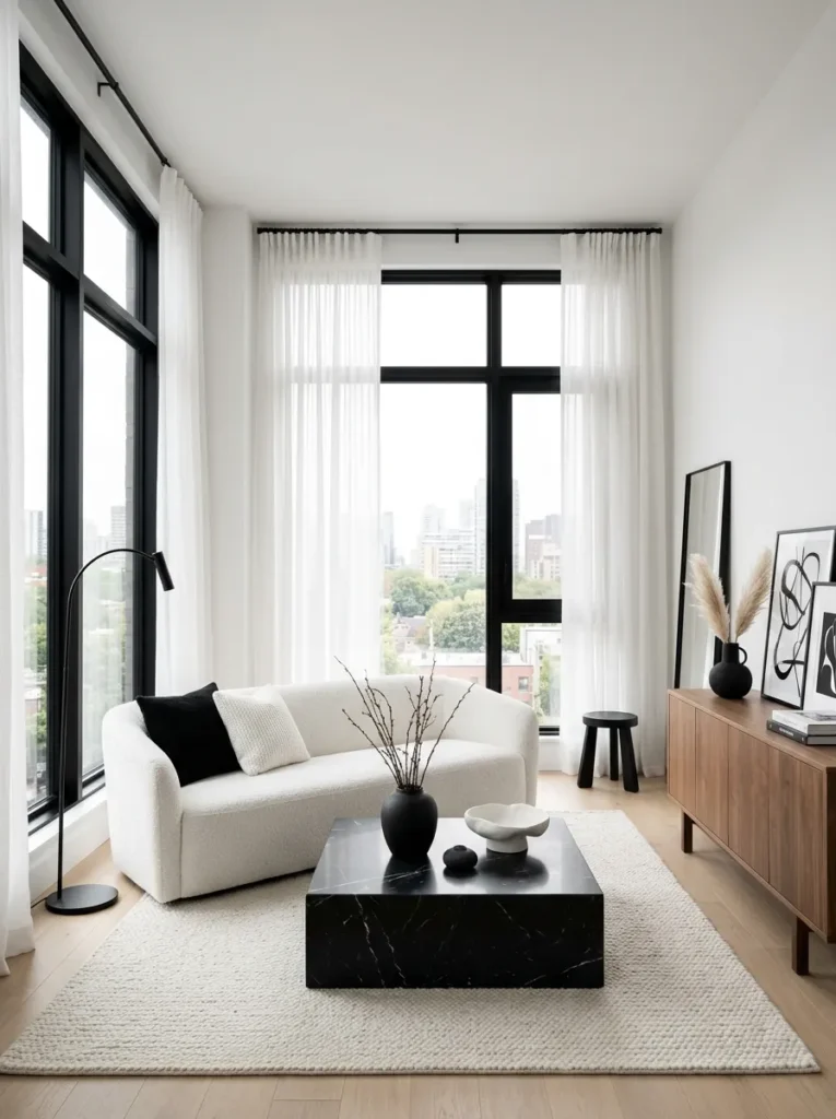
Soft, sheer white curtains paired with black curtain rods and black window trim create a striking contrast that still lets plenty of natural light into the room. This combination also keeps a fairly dramatic color scheme from feeling too heavy or closed in during the day.
At night, the same black trim reads as crisp and defined even with the lights on, so this pairing tends to work well around the clock rather than only looking its best during daylight hours.
16. Add One Unexpected Textural Object
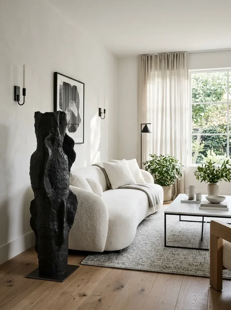
A single sculptural object, whether a black ceramic vase with an irregular shape or a woven white basket with an interesting weave, gives the eye something unique to land on. Black and white rooms benefit from at least one piece that doesn’t feel like it came from a matched furniture set.
This kind of object works especially well as a conversation piece, since guests are more likely to comment on one distinctive item than on a room full of coordinated, expected choices.
17. Keep Metal Finishes Simple
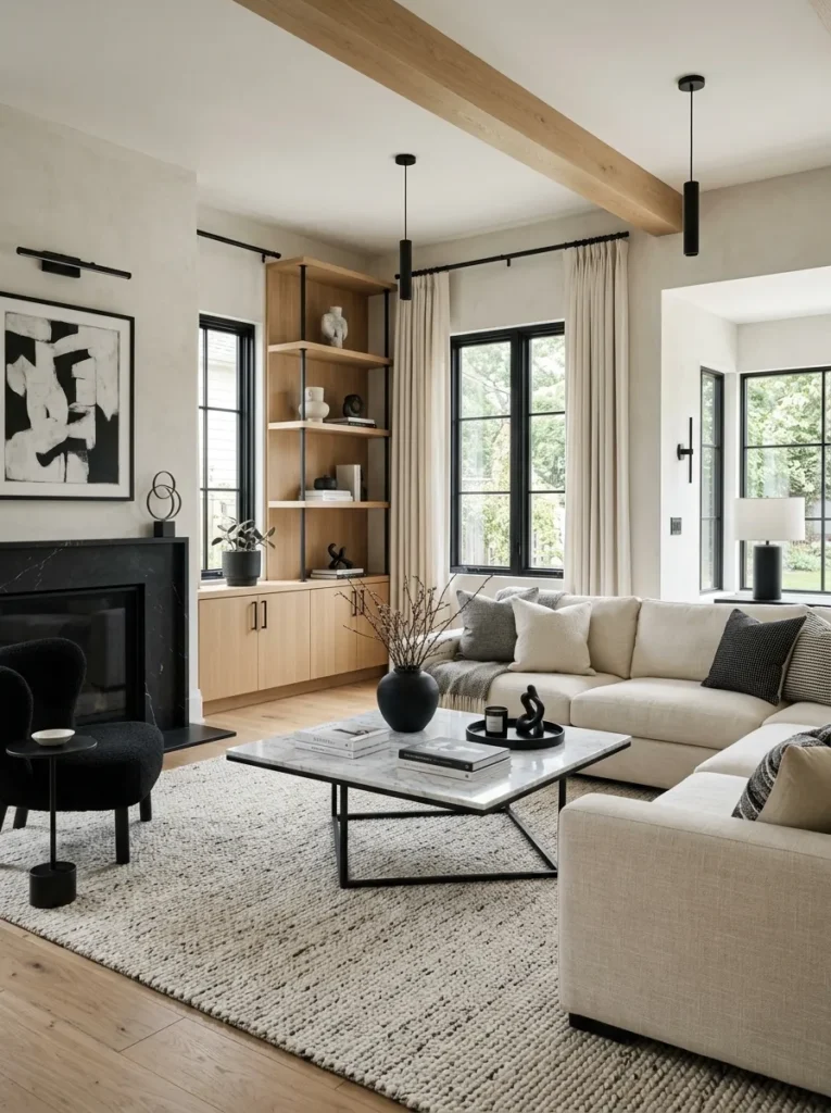
Stick to one metal finish, ideally matte black or brushed silver, rather than mixing several. Black and white schemes already carry a lot of visual contrast on their own, so adding multiple competing metal tones on top of that tends to make the room feel busier than intended.
If you already own mixed metal pieces, consider a matte black spray paint update on the smaller, less expensive items rather than replacing everything at once.
18. Use a Black Ceiling for Drama in the Right Room
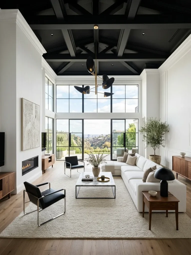
In a room with good natural light and reasonably high ceilings, painting the ceiling black can create a striking, cocoon-like effect that most people don’t expect. This works best in rooms that won’t feel closed in by the darker tone overhead, so it’s worth testing with paint samples before committing to the full ceiling.
Pairing a black ceiling with white or light colored crown molding, if your room has it, helps define the transition between wall and ceiling clearly instead of letting the two blend into one dark mass.
19. Add Black Boucle or Velvet Seating
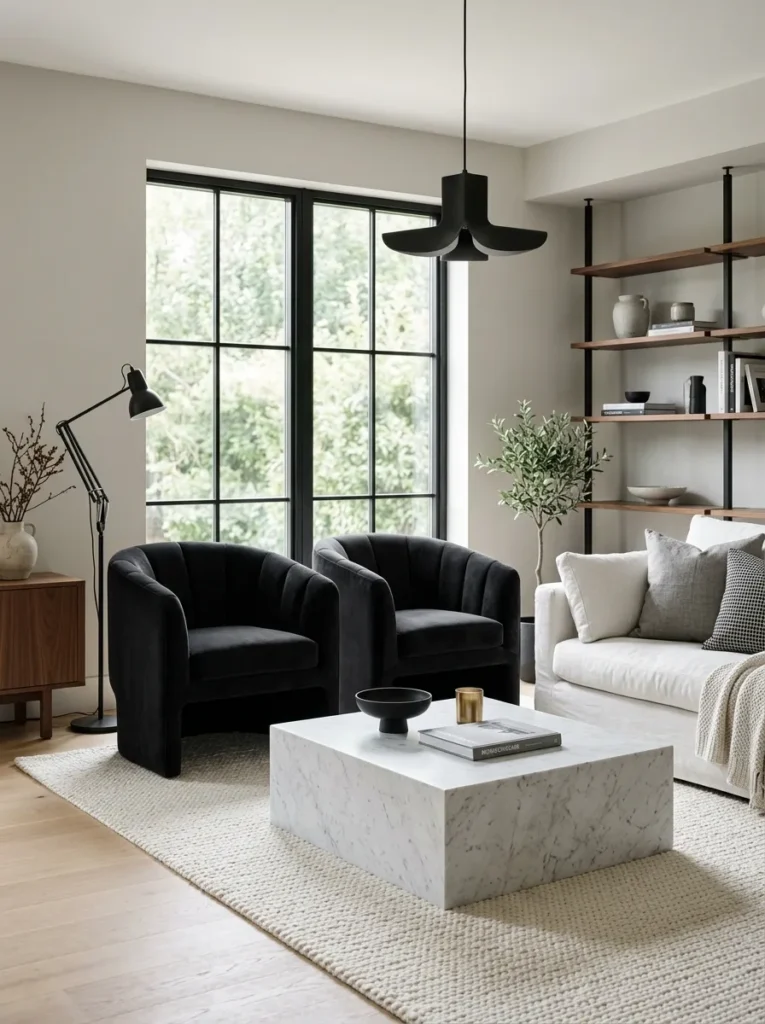
A black accent chair in boucle or velvet brings texture into the room’s darkest tone rather than leaving black confined to hard surfaces like frames and hardware. This softens what could otherwise be a fairly sharp, graphic scheme with something more tactile and inviting.
Velvet in particular catches light differently depending on the angle you view it from, which adds subtle variation to a black surface that a flat matte fabric simply can’t replicate.
20. Finish With a Single Warm Light Source
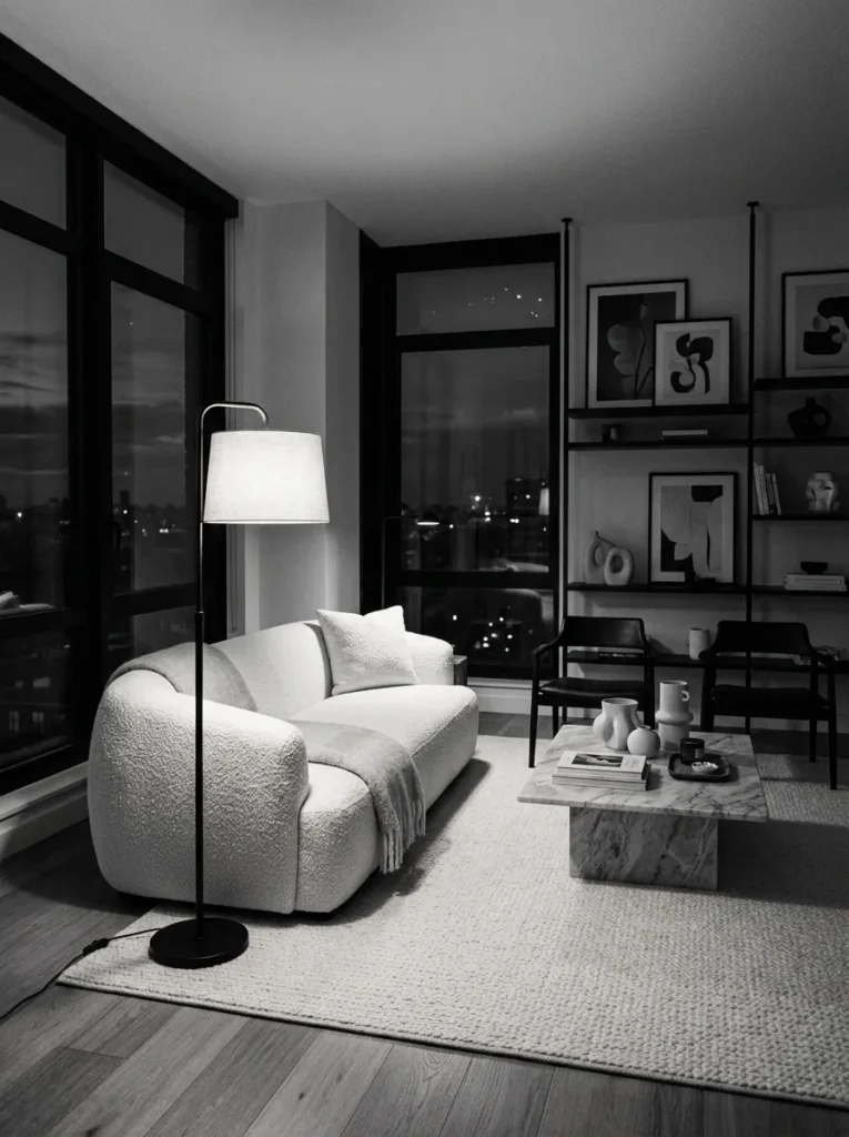
Even in a graphic black and white room, your lighting should lean warm rather than cool or stark white. A warm-toned bulb in the 2700K range keeps the space feeling livable in the evening, softening the high-contrast palette just enough to make the room comfortable to actually spend time in after dark.
Test your bulb choice at night rather than during the day, since a black and white room can look drastically different once natural daylight is gone and artificial lighting becomes the primary light source in the space.
Black and white rooms succeed or fail based on discipline more than any single decor choice. Hold your ratio, keep your blacks true and your whites clean, and let texture do the work that color would normally handle in any other color scheme.