

Neutral rooms get a bad reputation because most of them are done wrong. A truly good neutral living room isn’t just white walls and a beige sofa; it’s a careful mix of undertones, textures, and contrast that keeps the eye moving instead of going flat.
Here are 15 ideas that go beyond the basics and actually explain why they work:
1. Match Your Undertones Before Anything Else
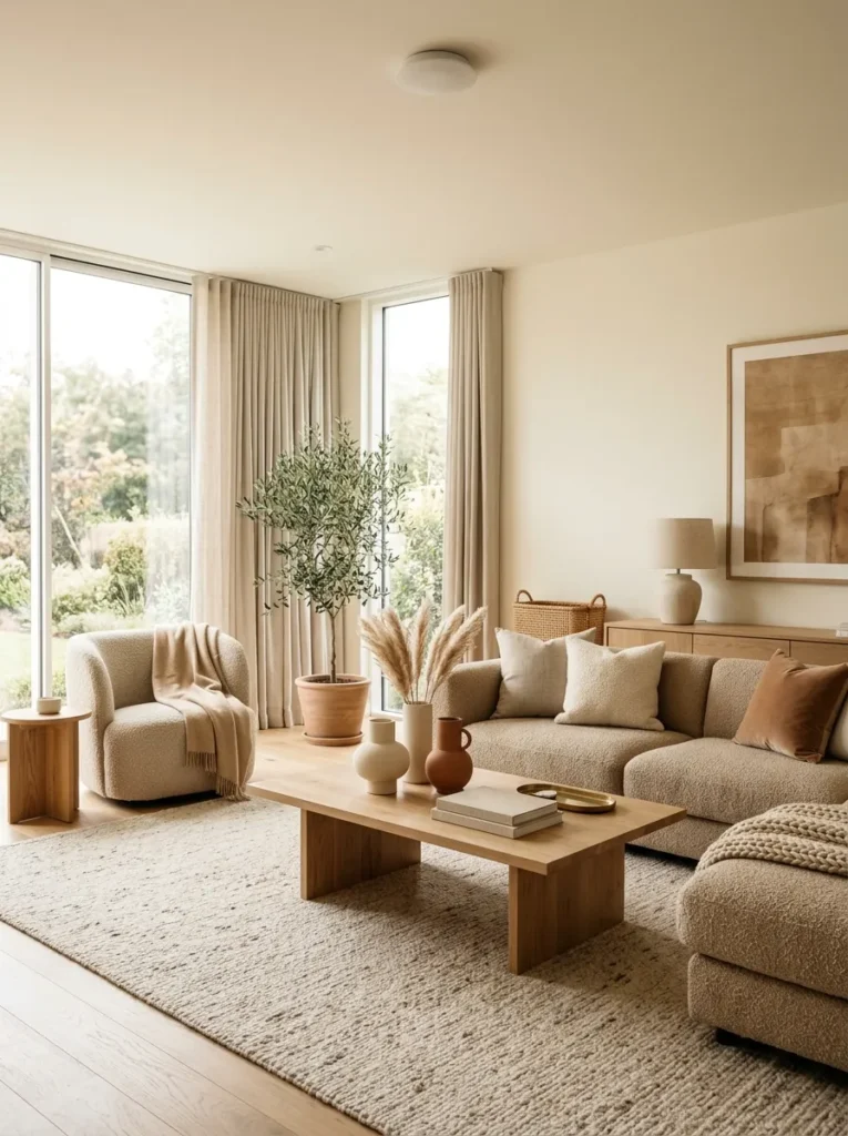
The single biggest mistake in neutral rooms is mixing warm and cool undertones without realizing it. A gray sofa with blue undertones next to a beige rug with yellow undertones will always look slightly off, even if you can’t immediately say why.
Before buying anything, hold your paint chip, fabric swatch, or rug sample next to natural daylight, not store lighting. Warm neutrals lean toward yellow, red, or orange at their base, while cool neutrals lean toward blue, green, or violet. Pick one direction and stay consistent across your major pieces.
2. Pay Attention to Light Reflectance Value
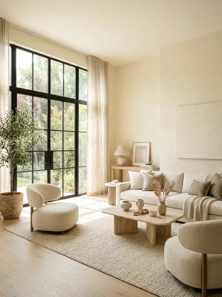
Paint professionals use a number called light reflectance value, or LRV, to measure how much light a color bounces back versus absorbs. Most neutral rooms benefit from walls in the 60 to 80 LRV range, since anything lower starts to read as a true gray or taupe rather than a soft neutral, and anything higher can feel sterile under bright light.
If a paint you love looks great on the sample card but flat on your actual wall, check its LRV. A shift of even ten points can be the difference between a wall that reads as warm cream and one that reads as dull off-white.
3. Build Contrast Through Value, Not Color
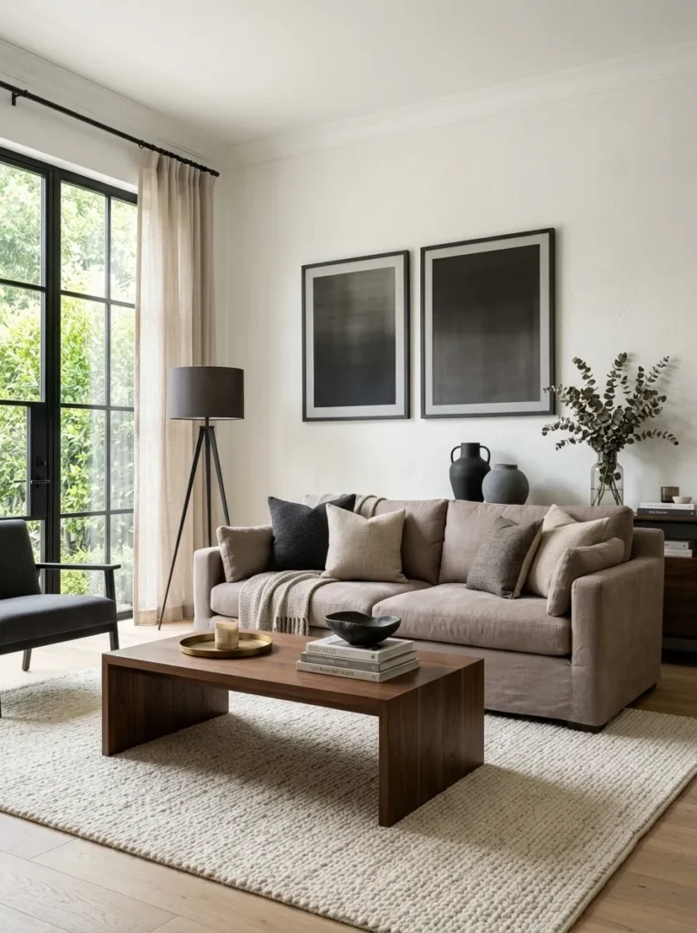
Since you’re not relying on bold colors to create interest, contrast has to come from value, the lightness or darkness of each element in the room. Pair a light wall with a mid-tone sofa and a dark wood coffee table so your eye has clear layers to travel across the room.
- Light: walls, ceiling, sheer curtains
- Mid: sofa, upholstered chairs, rugs
- Dark: wood furniture, black metal accents, framed art
Without this kind of value spread, a neutral room tends to flatten into a single wash of sameness that photographs poorly and feels lifeless in person.
4. Use at Least Four Different Textures
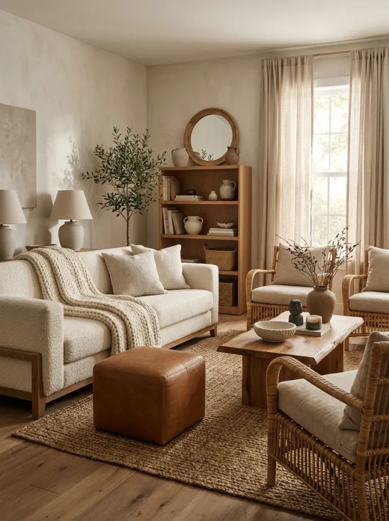
A flat neutral room needs texture the way a flavorless dish needs seasoning. Aim for a minimum of four distinct textures in the same space, such as a nubby boucle sofa, a smooth leather ottoman, a woven jute rug, and a matte ceramic lamp base.
Run your hand across each surface mentally as you plan the room. If everything you’re picturing feels roughly the same to the touch, the room will likely feel just as flat visually, even with a technically correct color palette.
5. Choose One Wood Tone and Repeat It
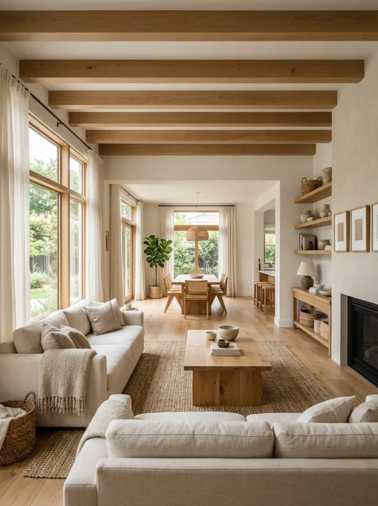
Mixing warm honey oak with cool gray washed wood in the same room creates the same clash as mismatched paint undertones. Pick a single wood family, whether that’s a warm walnut or a lighter white oak, and repeat it across your coffee table, shelving, and any wood-framed furniture.
6. Add Black as Your Grounding Color
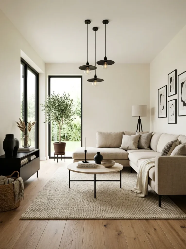
Every neutral room needs at least one true black element, or it risks feeling washed out and undefined. Black picture frames, a black metal light fixture, or even black candle holders give the eye a firm anchor point among all the softer tones.
Designers often call this the anchor rule. Without a genuinely dark element somewhere in the room, neutral spaces tend to float, lacking the visual weight that makes a room feel grounded and finished.
7. Layer Two Rugs of Different Textures
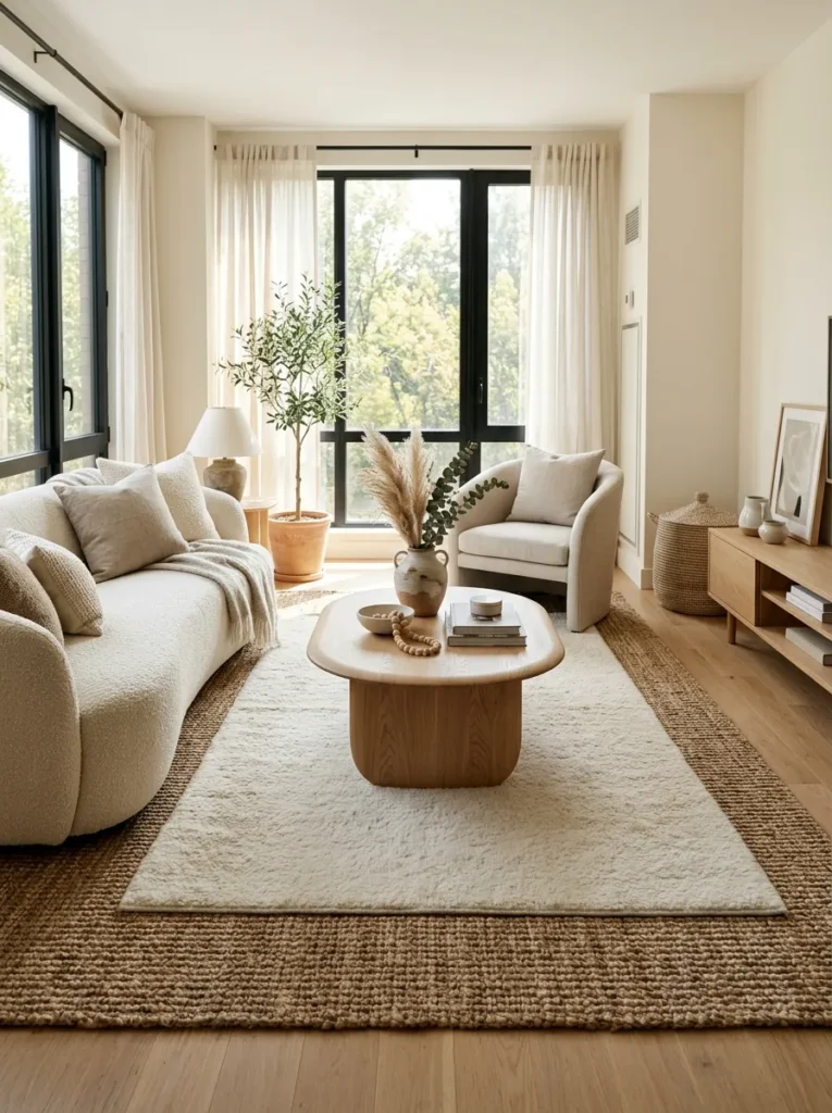
Placing a smaller textured rug, like a cowhide or a chunky wool, over a larger flat woven rug adds depth underfoot that a single rug can’t achieve on its own. This layered approach also breaks up what would otherwise be one large, uninterrupted expanse of neutral flooring.
8. Use Drapery to Soften Hard Architectural Lines
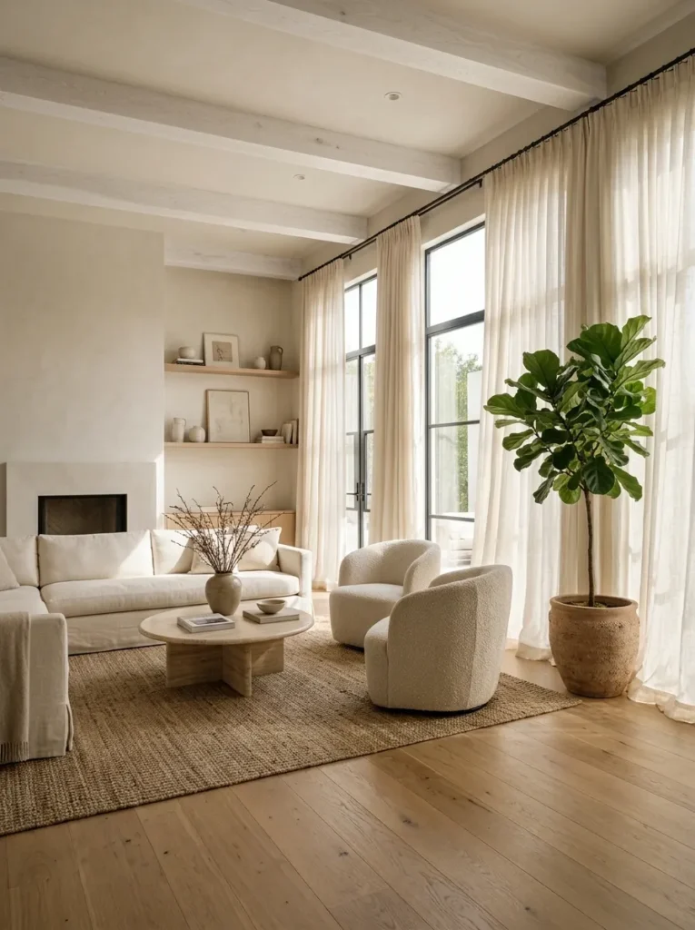
Neutral rooms with a lot of straight architectural lines, like large windows or exposed beams, can start to feel cold. Floor-length linen drapery in a soft neutral tone introduces movement and softness that counteracts the room’s harder edges without adding any actual color.
9. Choose Furniture With Varied Silhouettes
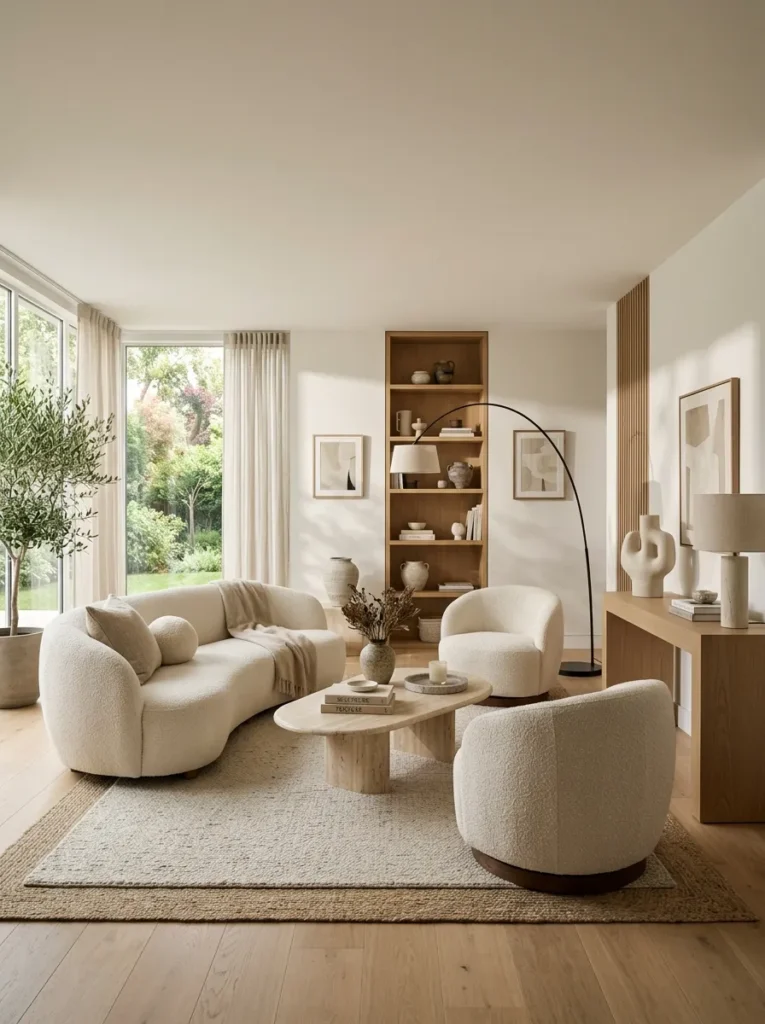
If every piece of furniture in your room has straight, boxy lines, the room will feel stiff no matter how well matched the colors are. Mix at least one curved or organically shaped piece, such as a rounded coffee table or a curved accent chair, in among your straighter furniture to keep the room visually dynamic.
10. Bring In Natural Materials for Depth
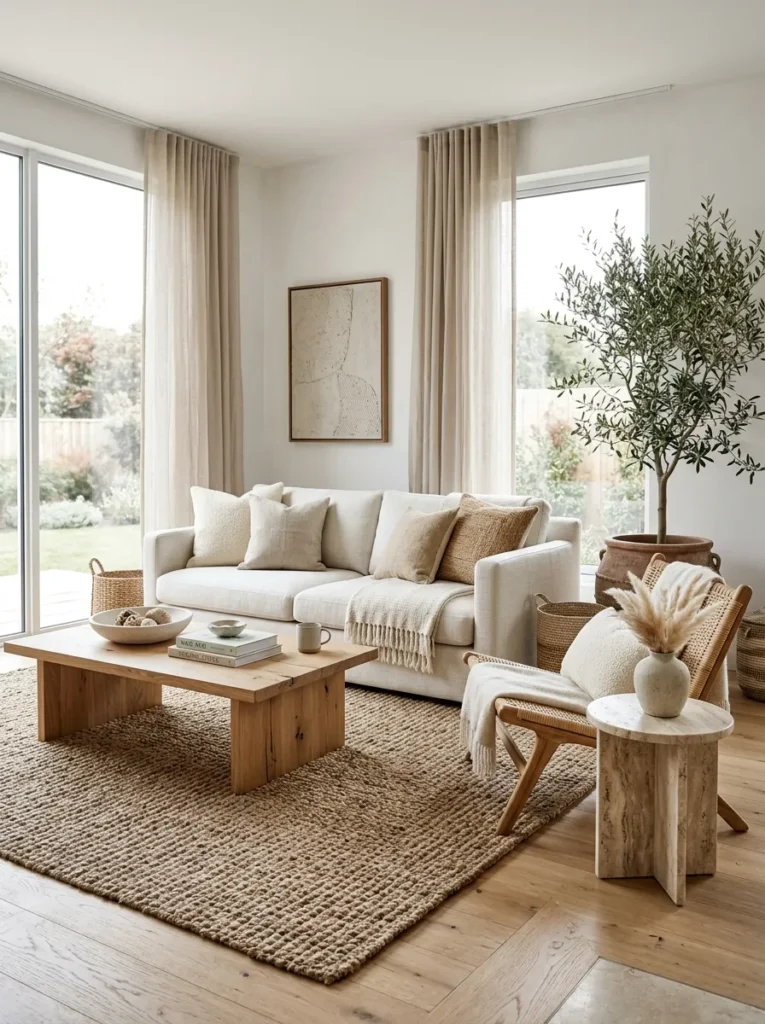
Stone, rattan, linen, and raw wood all carry natural variation within themselves, no two pieces are ever perfectly identical, and that subtle inconsistency is part of what keeps a neutral room from feeling flat or artificial. A rattan chair, for example, has more visual movement in its weave alone than a solid painted surface ever could.
11. Use Tonal Layering Instead of Matching
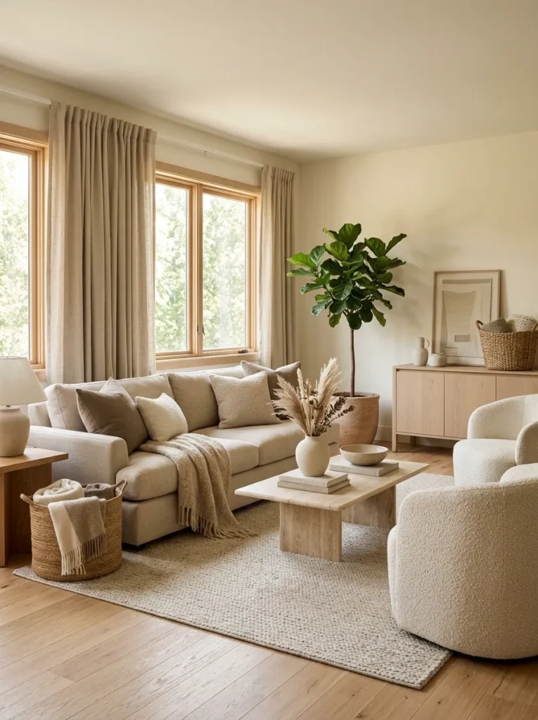
Rather than buying a sofa, rug, and curtains in the same shade, choose pieces that sit within the same family but at slightly different values. A room built entirely from one identical tone looks flat under most lighting, while tonal layering, several closely related shades used together, creates the kind of quiet depth designers aim for.
12. Add Movement With a Single Patterned Textile
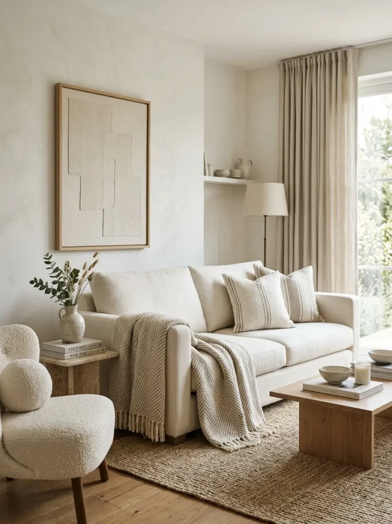
One subtle patterned pillow, throw, or piece of art, in tones that stay within your neutral palette, adds just enough visual movement to keep the eye engaged without breaking the calm the rest of the room is built around. A herringbone weave, a subtle stripe, or a faded ikat pattern all work well here.
13. Match Metal Finishes to Your Undertone
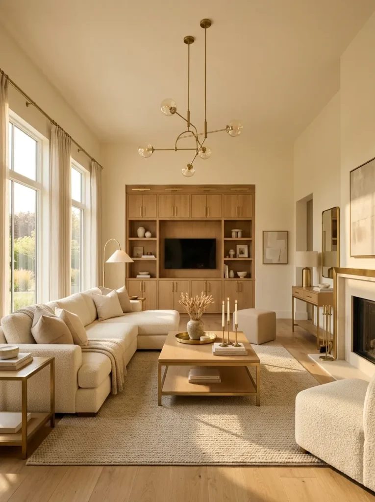
Warm neutral rooms generally pair best with brass, gold, or bronze hardware and lighting, while cool neutral rooms tend to look sharper with chrome, nickel, or black finishes. Mixing warm wall tones with cool metals, or the reverse, is a subtle mismatch that many people notice without being able to explain why.
14. Use Sheer Layers to Control Light Quality
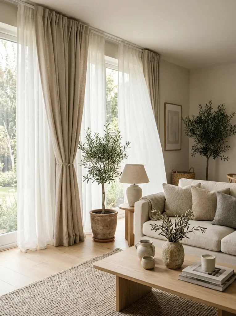
The quality of light in a neutral room changes how every color in it reads throughout the day. Sheer curtains diffuse harsh direct sunlight into something softer, which keeps warm neutrals from looking washed out at midday and helps cool neutrals avoid feeling gray and flat on overcast days.
15. Style With Negative Space in Mind
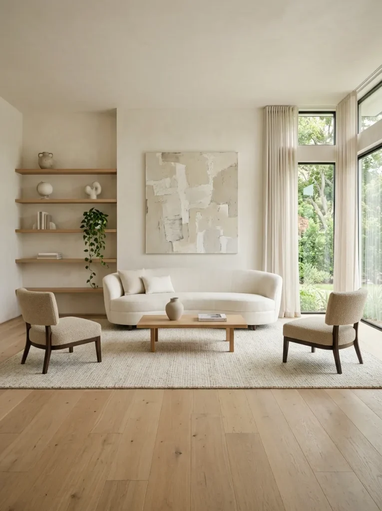
Neutral rooms rely more heavily on space than colorful ones, since there’s no bold pattern or bright hue to draw the eye elsewhere. Leave clear, intentional gaps between objects on shelves and tables rather than filling every surface, so the few pieces you do display carry more visual weight.
Getting a neutral living room right comes down to paying attention to the details that are easy to overlook: undertone, value, texture, and light quality, rather than just picking colors that all technically fall under the word neutral. Get those fundamentals right, and the room will feel calm and considered instead of flat and forgettable.